Onescape
Onescape
Onescape
A one-stop shop solution for students at Arizona State University to trade goods, find housing, interact with other students, and find local happenings. This is an academic project where we were tasked to design a platform to help the community.

My Role
UI Design
User Research
Duration
3 months
Tools
Figma
Miro
The Design Process
I followed a 4 step design process, which was repeated as needed. Finding out what the users need was the first step. The second step is to brainstorm and ideate design concepts and solutions. Then comes the prototyping phase, followed by user testing in the Verify phase. This process is iterative.

USER RESEARCH
We set out to ask various international and out-of-state students about their experiences moving to a new city for college. Our data indicated that incoming students had a hard time adapting to their new environment. Students also mentioned that they had trouble meeting new people, finding places to live, and shopping for used items (due to lack of transportation) in their area.
Who Are The Users?
We sent out surveys and conducted user interviews of 5 students attending Arizona State University including undergraduates, graduates, and PhD students all aged between 17 and 40 years old. Our users also included local, out-of-state, and international students.
The Challenge
Incoming students tend to struggle with finding housing, furniture, and home supplies in a new city, while some students want to sell items they own. Currently, students use third party websites and apps with a level of uncertainty, unfamiliarity, noise and lack of choice. Students also have a hard time assimilating into this new environment.
How might we create a place for students to meet their buying and selling needs, as well as stay connected with other students in the area?
What Do Our Users Need?
A faster way to buy and sell items
Efficient messaging and communication
A system that weeds out scammers
Users looking to sell items wanted an efficient inventory management system
Convenient pickup location or delivery option for users who cannot travel
IDEATE
The next step was to create a platform that meets the above user needs. Our team decided that a website would be a good starting point because all participants we surveyed said they had plenty of experience with computers and the web.
To do this, we created some task flows and developed a navigation for the site.
Wireframes
We began by sketching pen & paper wireframes for the homepage, then for the rest of the tasks. Once we were pretty satisfied with the layout we turned them into digital wires.
Home Page


Community Page


Testing
We recruited 5 potential users to test our low fidelity prototype. We gave the users a series of scenarios and a series of tasks within each scenario to test out different task flows within the site. The time taken to complete each task was then recorded as the dependent variable.
Buy Filters
Users had trouble using the dynamic filters when browsing the item catalog. They could not undo the applied filters and the search bar was found glitchy.

Creating A Post
When trying to create a new post in the community page, users could not find the "Create Post" CTA as it appeared below the fold. This was then corrected to appear above the fold.
Inventory Management
After adding an item to the seller's inventory, users wanted to view and/or edit item details. To fix this, we added a popup that appears right after the item is added, as well as a list view for recently added items that takes the user to the details page.

Style Guide
For this website, we used blue as the primary color. According to color theory, blue is associated with trust and reassurance, which we found were qualities users were looking for during our research phase. For text, we used Inter, as it provides great readability. We also added hover and clicked effects on buttons for visual cues.

Final Screens & Prototype
1. Buy Flow
Using the test results, we fixed the search bar glitches and it now displays search suggestions. The dynamic filters now display results as they are selected.
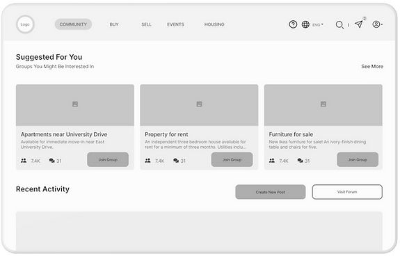
2. Community section
Accessing the community page now requires the user to log in through the ASU portal. The "create post" CTA appears at the top of the page. Recent activity as well as local groups appear above the fold.
3. Inventory
Sellers can now view item details after adding an item to the inventory. Recently added items appear as a list for quick access.
4. Help Center
Users now have an option to send in their own questions in the help center in case they don't find a matching article. Quick links have also been added to FAQs under the search bar.