.png)
Project
thEATer
Timeline
March - May 2022
My Role
UI Design, Research
Overview
The thEATer app lets customers place movie snack orders ahead of time and pick them up when they arrive at the movie theater. This allows them to skip long wait times and not miss out on important parts of the movie. Since this was a personal project, I conducted the research as well as designed the interface of the application. All designs were made using figma.

The Problem
Avid movie goers dread waiting in line to order snacks right before the movie starts and missing . They also dislike the high prices and are unable to find deals and offers to help save some money.
Getting To Know The Users
I interviewed 5 users to get a sense of their movie-going experiences. Users were in their mid-twenties who had plenty of experience with technology, and liked going to the movies at least once a month.
Asking The Right Questions
I prepared a set of questions for interviews asking them to describe themselves and essentially asking them to walk me through their time at a movie theater. Demographics questions were presented at the start of the interview.
Research Questions
-
What are some of your favorite movies?
-
How often do you like to see movies on the big screen?
-
Do you always order snacks? What are some of your favorite snacks to order?
-
What do you like about ordering snacks at the theater?
-
What do you dislike about ordering snacks at the theater?
-
What is most important to you when it comes to buying snacks?
-
Is there anything you would like to see added to make the process easier?
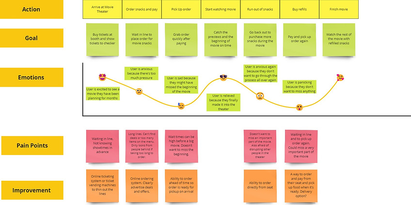
Key Insights
Here are some common themes I noticed in the interview responses.
-
Long lines were a major pain point for most participants. Users would like to skip wait times to avoid missing parts of the movie.
-
Users felt rushed while ordering and wanted more time to browse the menu.
-
Most users felt that snacks are too expensive and wanted to find ways to save money, such as deals and offers.
-
Leaving the seat to get refills was a major pain point for most users.
User Journey
Using the insights gathered from user interviews, I plotted a journey map for the user's movie going experience.
Competitive Analysis
I analyzed some existing solutions in the market to our snack ordering challenge. The two main competitors I found were AMC and Cinemark. I analyzed their products based on scales such as ease of use, visual design, navigation, and checkout process. Here are some things I noticed:
-
Both apps have a simple design. User selects the "Food & Drinks" menu from home page, then proceeds to the menu page and places their order. Branding is simple, but consistent.
-
In the AMC app, once users proceed to checkout, editing the cart is fairly difficult. Pressing the 'back' button cancels the order and user has to start over. In the Cinemark app, the user cannot access the menu unless they sign in or provide card information. This is a major pain point.
-
The AMC app is easy to navigate and the 'snacks' page can be found in the bottom navigation menu. On the other hand, the Cinemark app is not as friendly for new users as they have to do some searching to find their way around the app.
The Solution
Based on research findings, I concluded that a mobile app that let's users order ahead of time, view deals and special offers, and pick up their food on arrival would be the most efficient solution to the problem. Unlike other apps, this app does not require the user to log in or provide any information before viewing the menu.
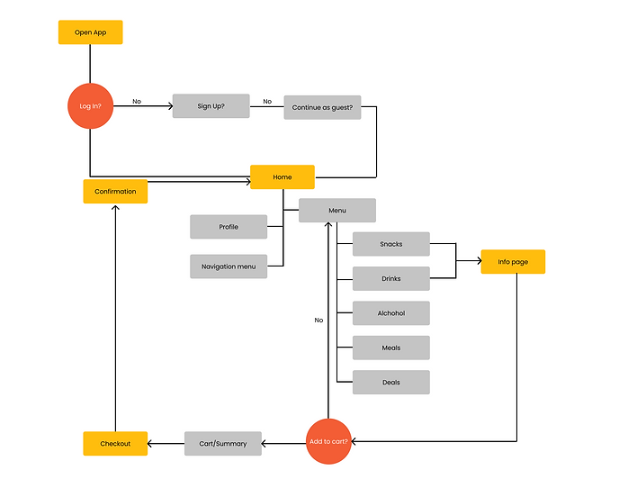
User Flow
This is the user flow from start to finish. The flow includes all the actions the user can take to successfully order snacks using the app, select a payment method, and set a time to pick up the order.
Wireframes
Based on research findings, I went on to create lo-fi wireframes for the website. I created a prototype so could test out the user flow and overall feel of the website.

Style Guide
The colors I used for this app resembled the atmosphere of a movie theater. Red/Orange and yellow are commonly used by food brands, and generally represent warmth and excitement. I used a tan color as my background because it looks like popcorn butter, which seemed fitting for the purpose of this app. For the font family, I used Poppins to give the text a clean, geometric look.

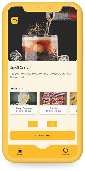
Final Screens & Iterations
-
Users mentioned that they wanted more than one method of payment and the ability to set a pickup time before paying, in case they wanted to place an order well in advance.
-
The initial version of the app did not include an item info page and directly added items to the cart from the menu. I added an info page, where users can edit the quantity of the item they want as well as suggestions to add more items.

Next Steps
Although this app has a simple user flow, here are some things I would like to add moving forward.
-
Dark Mode - One user pointed out that if she were to use this app inside the theater, the bright colors could be an annoyance to other watching the movie. Therefore, a dark mode version app needs to be implemented along with a feature that lowers the phone's brightness.
-
More screens - Additional screens for features such as a rewards system. For example, a delivery option, which enables the user to get snacks delivered to their seat.
-
Bigger scope - During the research stage, I found that other similar apps that are used to order movie snacks were embedded in a bigger app for movie ticketing and browsing. This app could potentially be expanded into something along those lines.